
How to Get Bold, Vibrant DTF Colors That Pop on Any Shirt
July 26, 2026 · 4 min read
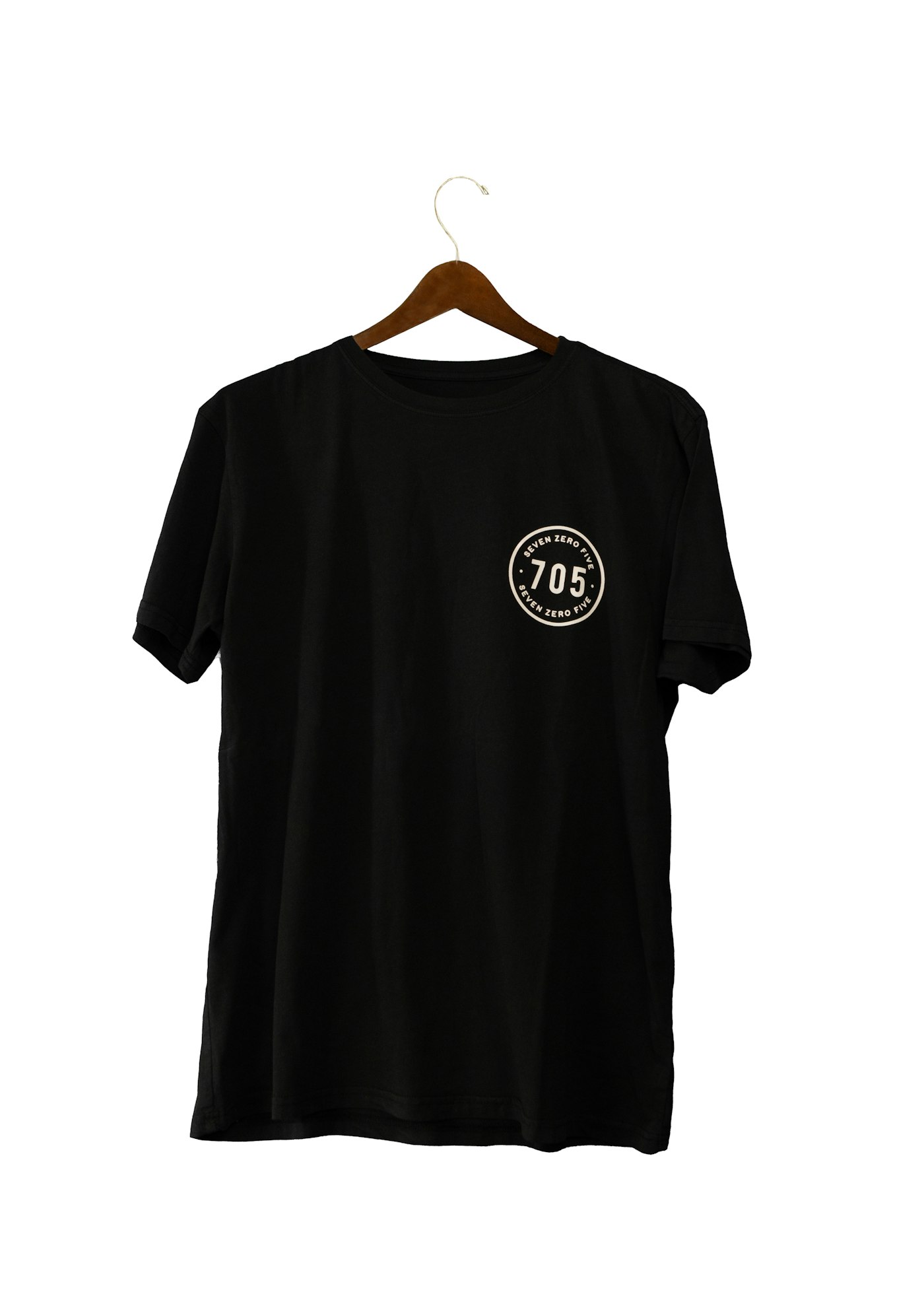
Ever notice how a DTF print looks just as bright on a black shirt as it does on a white one? That's not luck — it's built into how DTF works. Here's why the colors pop, and how to squeeze out every bit of that vibrancy.
The white underbase does the heavy lifting
Before your colors go down, DTF prints a layer of white ink as a base. That white "backboard" is what lets bright color sit on top without the garment color muddying it — so a bold red stays red on navy, and neon stays neon on black. It's the single biggest reason DTF looks so punchy on dark garments where other methods struggle.
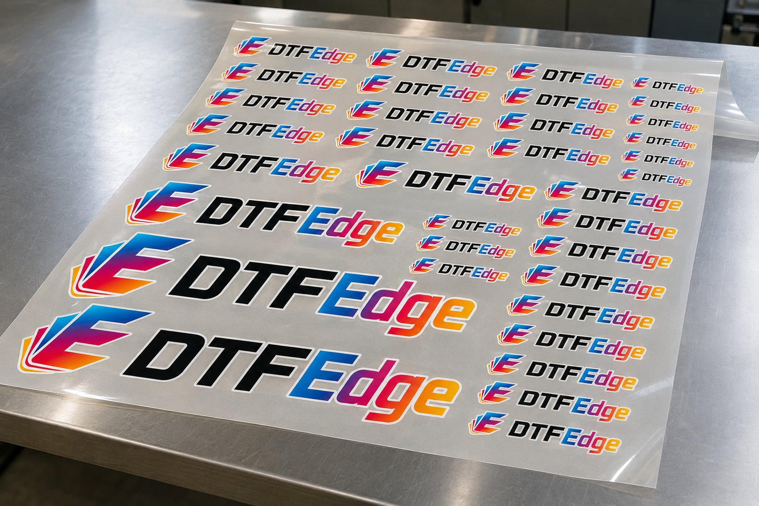
Full color, no compromise
DTF prints the full color range — gradients, photos, fine detail — with no per-color fees and nothing to simplify. If your design looks vivid on screen, it can look vivid on the shirt.
Get the most out of it
- Start with a strong file. A clean, high-resolution, transparent PNG at print size gives the printer the most to work with. Our file-prep guide covers the details.
- Lean into contrast. Bold, saturated artwork with good contrast reads best on a garment — subtle pastels can look washed out from across a room.
- Press it right. A proper press sets the color and the finish; under-pressing can dull it. See the pressing guide.
Bright, true-to-your-design color on any garment color is DTF's calling card — and it's a big reason prints look so professional. Upload your art and see how it pops.
Ready to see your design on a gang sheet?
Upload your art, arrange it, and we print and ship fast — no minimums.
Start Building Your Sheet